Travel Time
The Travel Time page allows the user to compare travel times along a specified route.
Learning Objectives
By the end of the tutorial, users will be able to:
- select a route and four week time frame
- understand the selection options for plotting travel time
- know how to use the plotting tools
- download data
Step 1: Select a route
Users can either use the drop down menu select among several predefined routes, or use the map to create a route by using the zoom buttons in the upper left corner and selecting several continuous stations. After clicking on a starting station a blue star will appear indicating the next available station along a potential route. If you want to delete the route click on the the "X" button at the bottom left corner of the map.
Step 2: Select a start week
Only four weeks of data can be plotted at one time; which includes the selected start week plus the previous three weeks. Weeks are measured Sunday through Saturday.
Step 3: Select the number of reliability weeks
The default for reliability weeks is 26 weeks and can be increased or decreased based on the user's needs.
Example
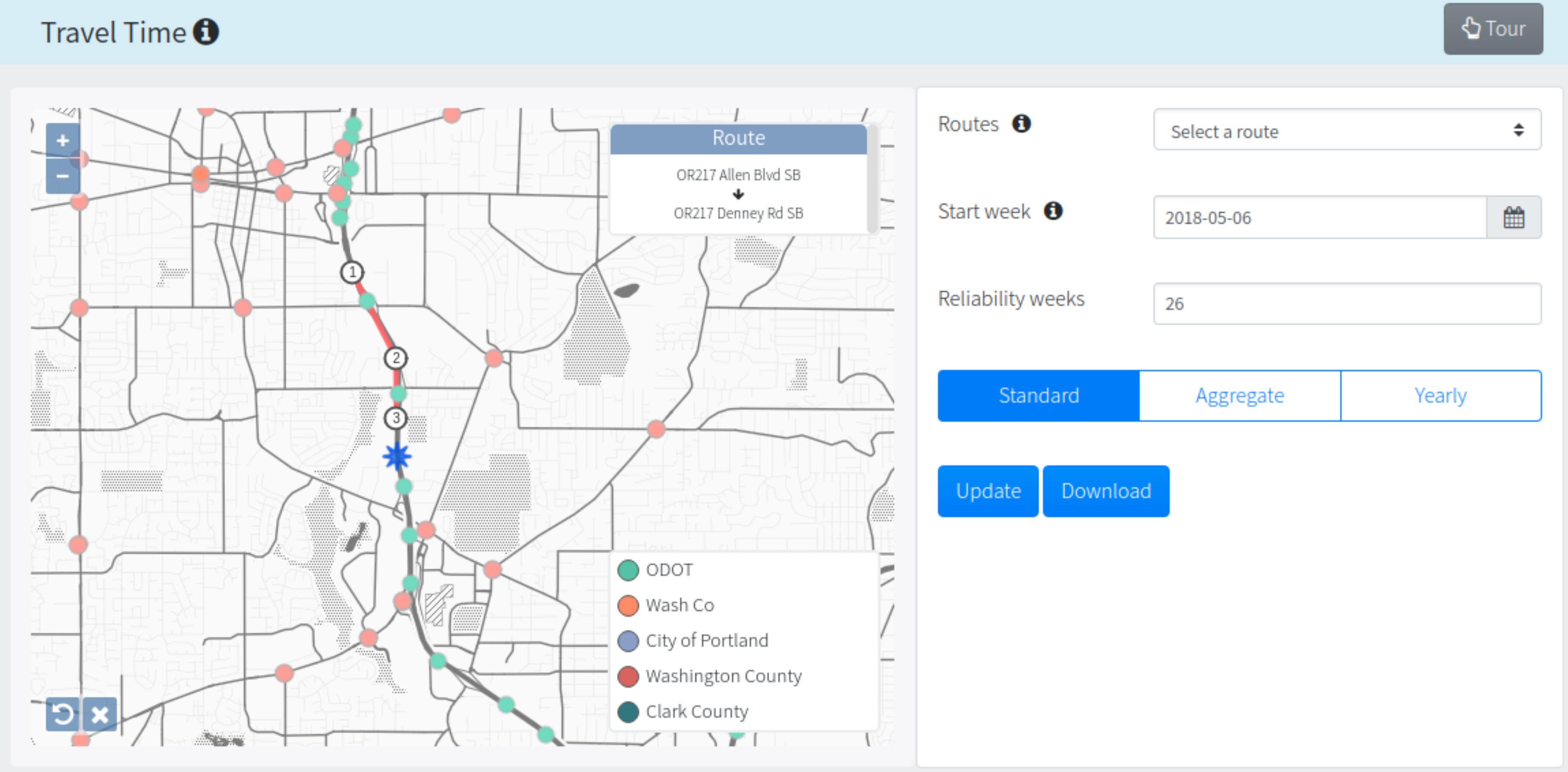
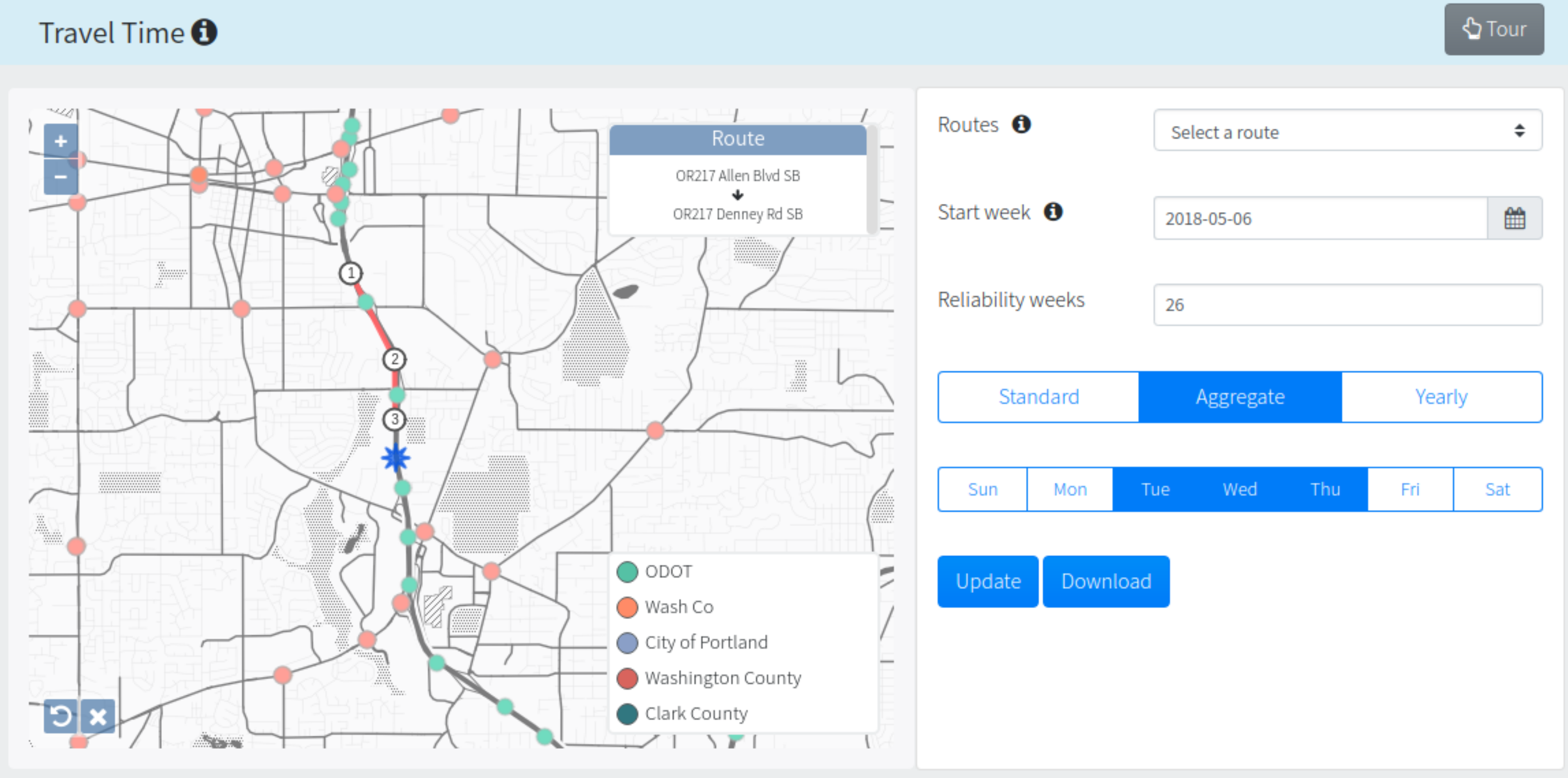
Step 4: Select the type of data to be plotted or downloaded
The default for the type of data plotted is set to standard where the standard plot shows detailed travel time for each day per week (Figure 1). The aggregate option shows hourly average travel time per hour aggregated by user-specified days of the week per week (Figure 2). The yearly option shows hourly average travel time per hour aggregated by user-specified days of the week per year. By default, for aggregate and yearly all days are selected. Click on the individual days to unselect/select the days of interest.
Example
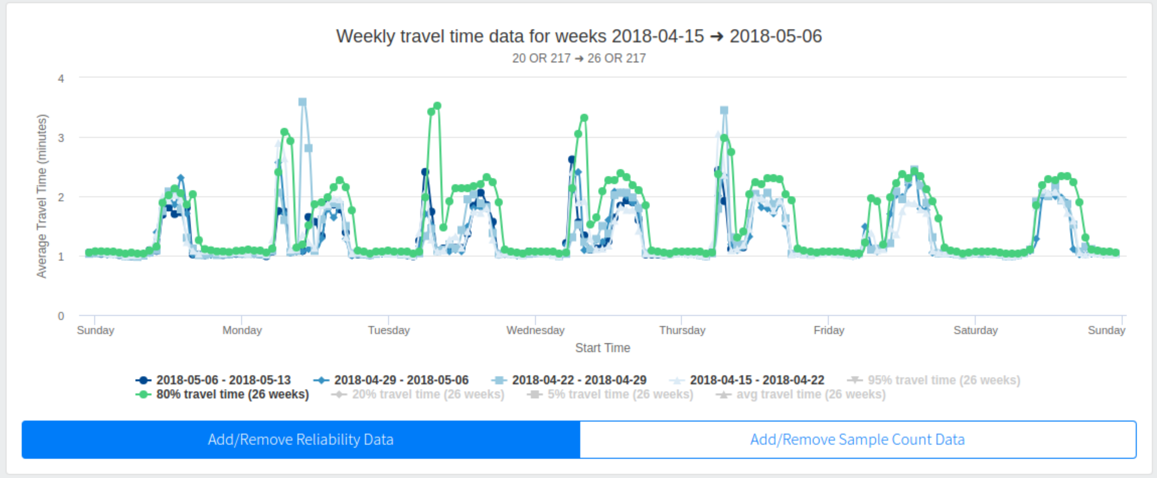
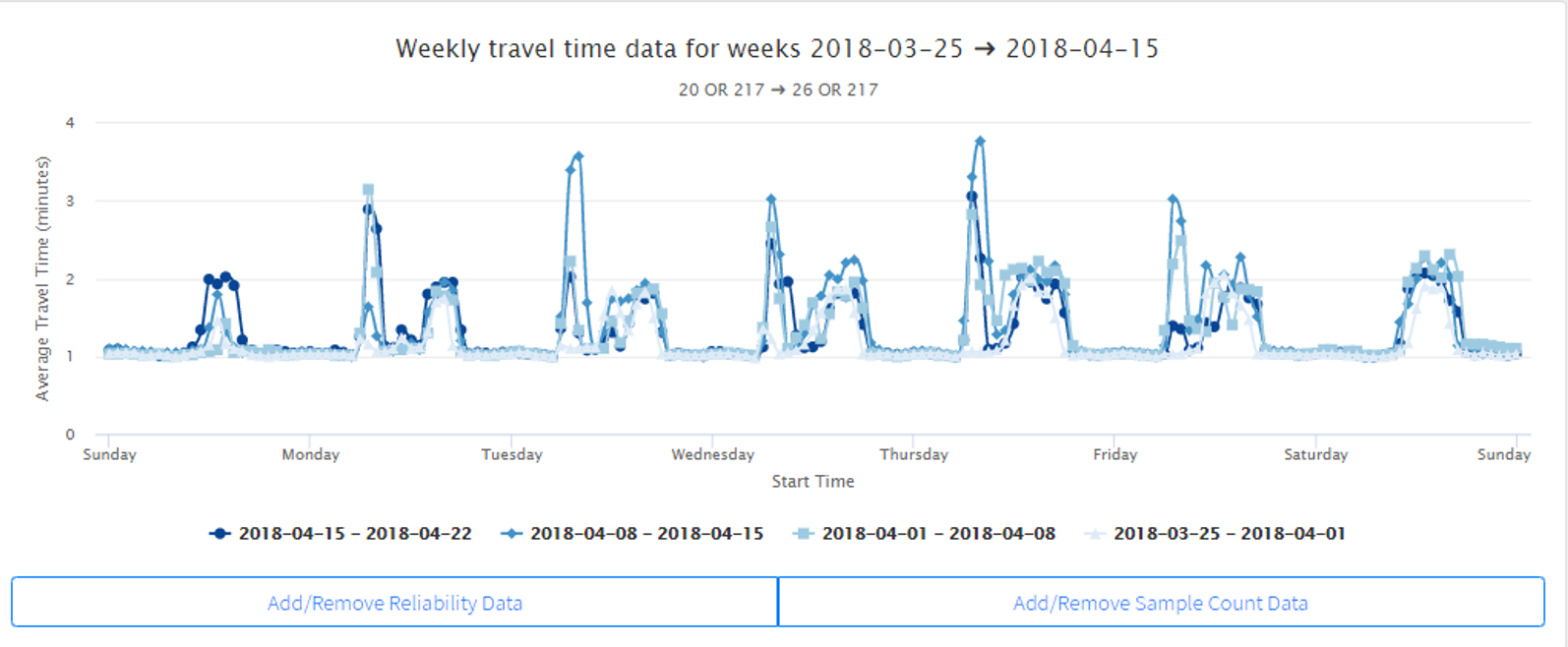
Step 5: Plot the data
Click on the update button to plot the selected data. The initial plot generated will show the hourly average time for each week. Each week of data can be turned on or off by clicking on the legend key.
Example
To add reliability data click on the "Add/Remove Reliability Data". The 80% travel time is plotted by default. Other travel time percentiles are shown in the legend and can be turned off or on by clicking on the respective key.
Example
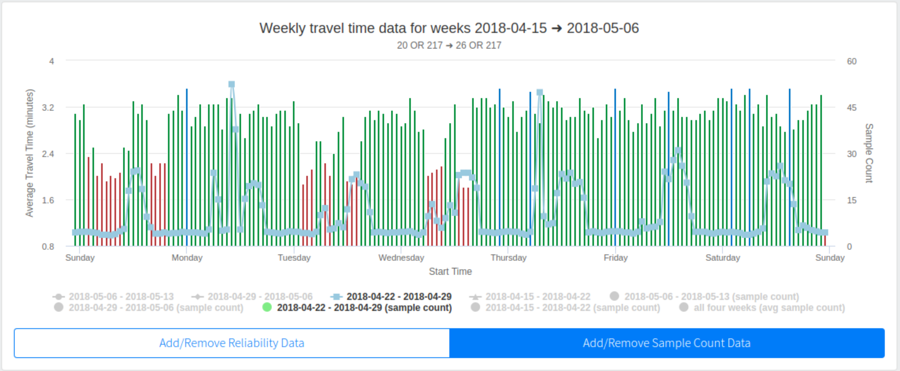
To add sample count data click on the "Add/Remove Sample Count Data". By default, none of the options are selected. Hourly sample counts are segmented by week. Click on the legend key to turn on or off sample counts.
Example
When the pointer is scrolled over a data point a window will pop up providing the time stamp and average travel time for each of the plotted points selected in the legend.
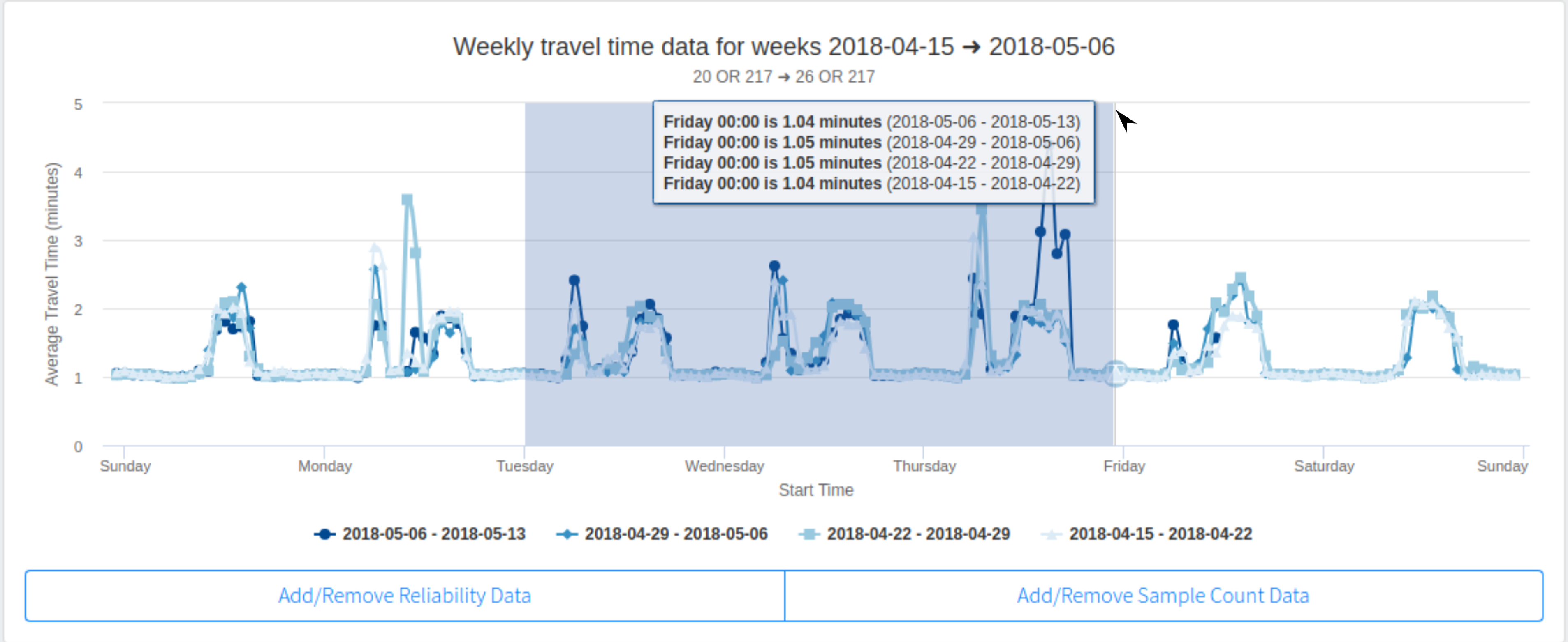
Example
For higher resolution data visualization the user can zoom in on the plot by clicking at the start point of interest and dragging the cursor to the end point of interest. The time frame of interest will be highlighted and will then zoom into that specific time frame. Click the "reset zoom" button in the upper right corner of the plot to revert back to the original plot.
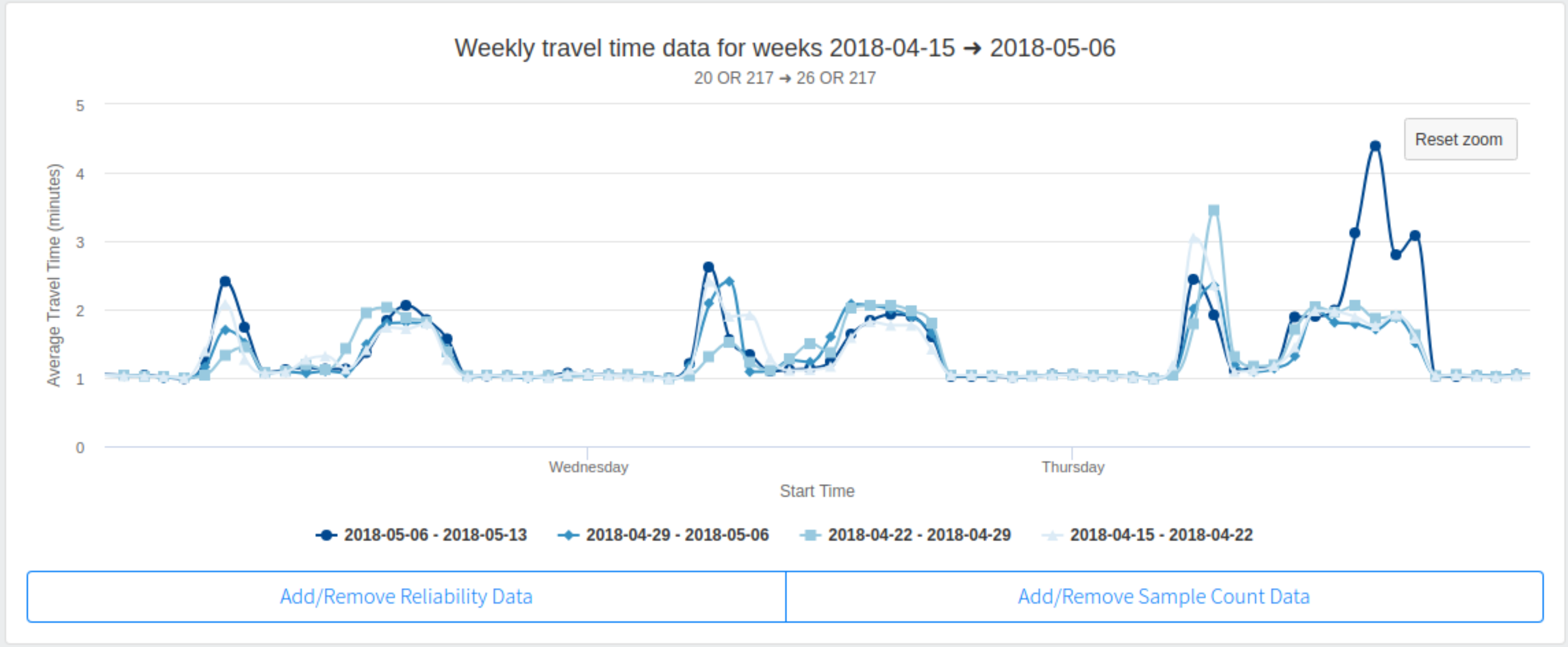
Example
The Aggregate plot shows average travel time aggregated by hour of day for the selected days of the week (Tue, Wed, Thu) in this example. As with the standard plots, weeks can be turned on and off by clicking on the legend key, scrolling over data points will show a pop up with time stamp and average travel time for each of the items selected in the legend, and zooming is supported.
Step 6: Download data
Data used to plot average travel time and sample counts can be downloaded by clicking on the "Download" button. A zip file will be created and contain two files: 1) data used to plot reliability average travel time and the four week average sample count where the given "time" is the day of the week and hour of day; and 2) travel time and sample count per hour with a time stamp (yyyy-mm-dd hh:mm:ss).
References
Reliability Weeks
The number of reliability weeks chosen determines the number of weeks used to calculate average travel time. Reliability is in reference to the level of consistency of observed average travel time measured daily or for different times of the day. The greater number of reliability weeks selected, the more accurate the travel time.
Travel Time
PORTAL provides four travel time reliability calculations of 95%, 80%, 20%, and 5%. A 95% reliability time refers to ranked travel time within the 95th percentile, which is equivalent to being late once a month. An 80% reliability time is equivalent to being late once a week. A reliability of 5% travel time is equivalent to free-flow. More information on travel time reliability can be found here.
Average Travel Time
The average travel time is the same as travel time calculated at the 50 percentile over the user selected reliability weeks.
Sample Count
Data used to calculate travel time on freeways comes from readings taken every 20 seconds from loop detectors. Data used to calculate travel times from arterials generally comes from bluetooth detectors and taken each time a car is detected, suggesting travel times along arterials might be less precise due to this method. Sample counts show the number of samples used to calculate travel time for each week. Travel time calculated with sample counts less or equal to 30 (and indicated with a red color) is less than ideal. Travel time calculated with sample counts great than 30 and less than 50 is acceptable. And travel times calculated with sample counts greater than 50 is best. There is also an option to see the average sample count for all four weeks.
Last updated: 2018-07-08