Stations
The Highway Stations page allows users to view vehicle volume, speed, occupancy, VMT (Vehicle Miles Traveled), VHT (Vehicle Hours Traveled), travel time, and delay from selected stations. This tutorial will cover:
- Selecting stations from the map for analysis and viewing their data availability
- Generating two-quantity charts and one-quantity historic comparison charts
- Using the Metadata tab to filter, search, and select stations without using the map
Map
The number on each dot indicates the number of stations in that area, and the bar below the dot indicates the average data availability in that area. As the map is zoomed in, the stations disaggregate until all stations are shown individually.
The colors of the stations differentiate ODOT and WSDOT stations, as well as mainline and ramp stations. Mainline (regular) stations track normal highway lanes, whereas ramp stations are located in on- and off-ramps.
Selecting stations to view
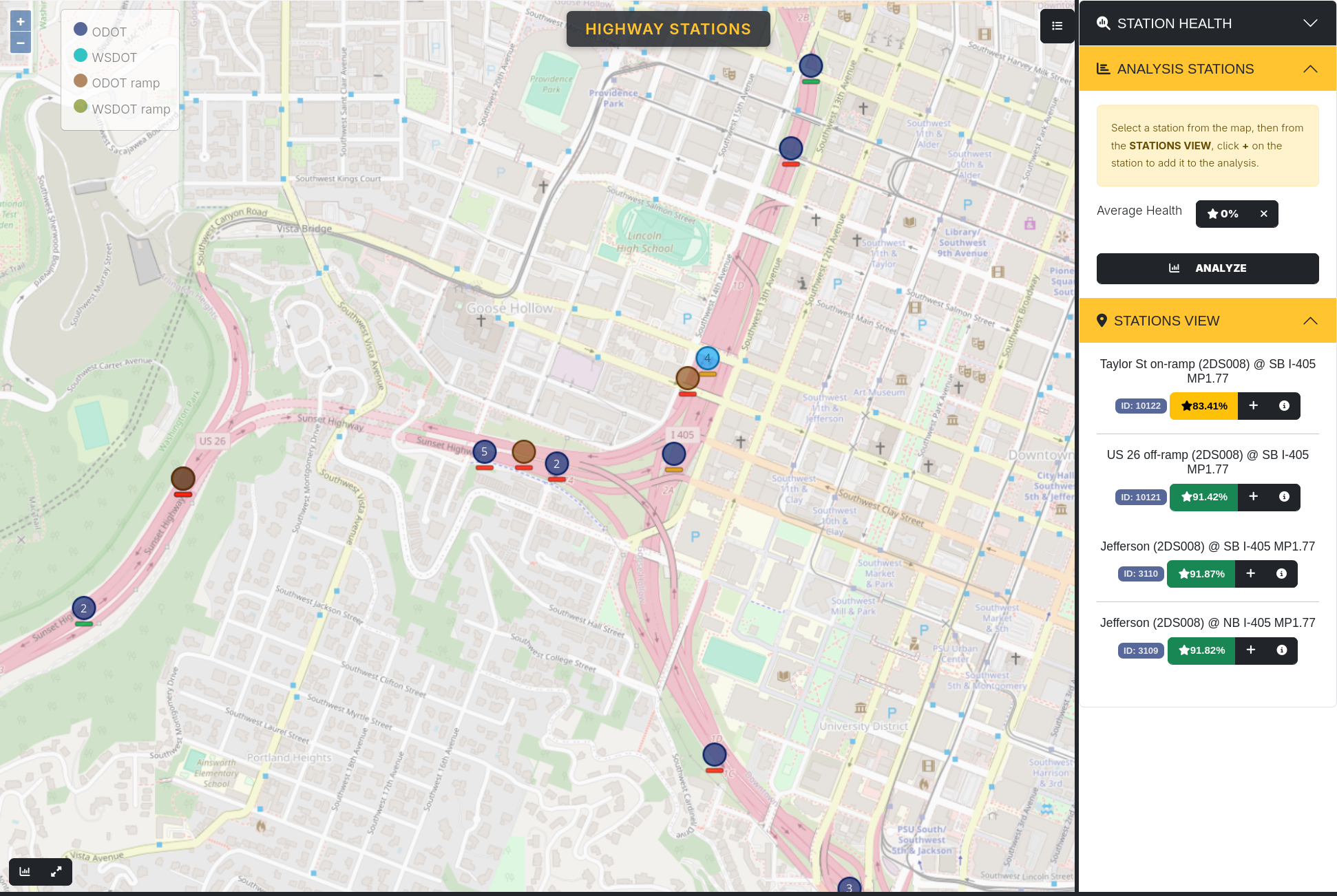
Each time you select a dot, by clicking on a circle icon, the icon will change to a light blue color and the station or stations grouped within that dot will show up on the right sidebar under “Stations View.”
Viewing data availability
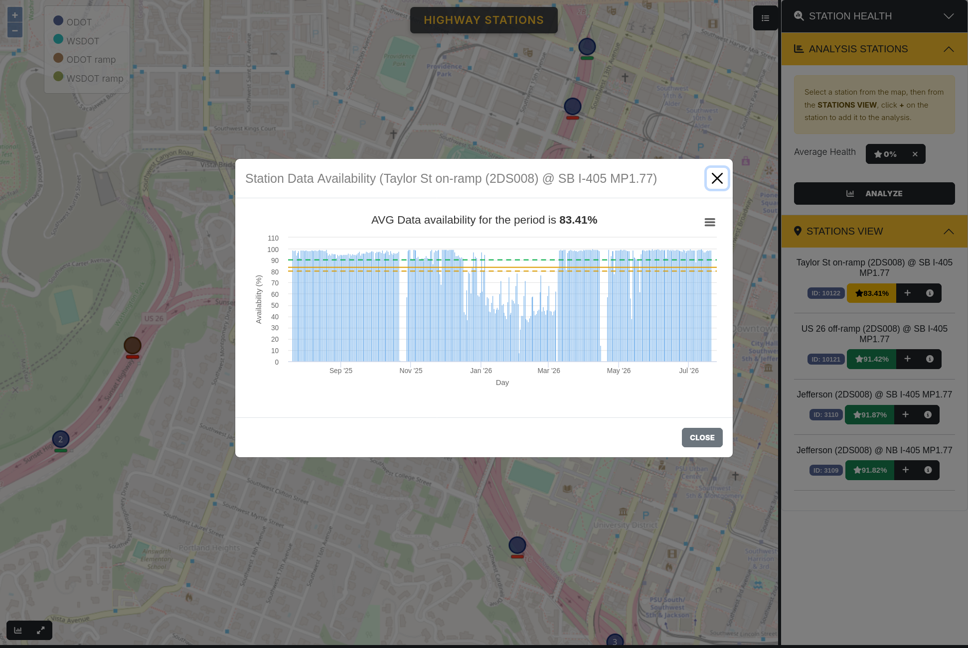
The percentage below the station name shows the average data availability on that station within the selected time range. When clicked, it will show a more detailed graph of data availability over time. This makes it easier to select stations with reliable data for the time frame you want to do analysis on.
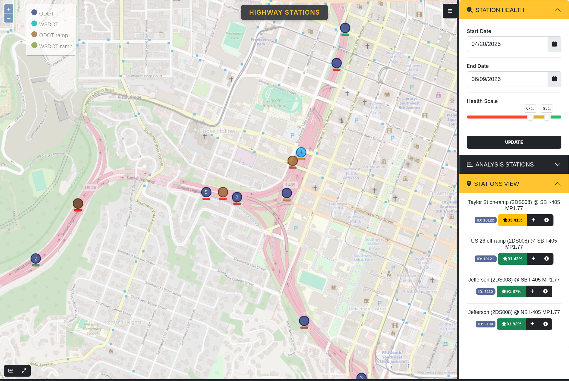
The time frame for the analysis can be adjusted in the Station Health tab in the sidebar menu, as well as the station health color scale. The color scale controls what percentage data availability is considered good (green), acceptable (yellow), or bad (red).
As an additional note, the map will always show the stations as they exist within the selected time range. If you're looking for a station that has been moved or deactivated before the present, restrict the end of the time range in Station Health to before it was moved/deactivated and that station will be visible.
Adding stations for analysis
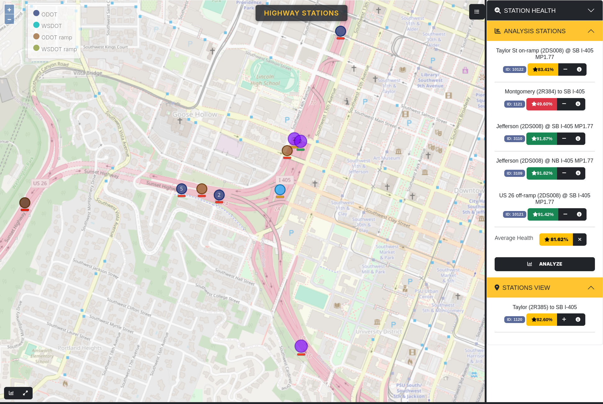
To add a station for analysis, click the + button on the Stations View tab. Its dot on the map will turn purple and the station will show up on the Analysis Stations tab. The average health for all included stations is shown at the bottom of the tab, and can be clicked for a more detailed graph, in the same way individual stations can be. Clicking the x button to the side of Average Health will clear the entire list of stations, and clicking the - button on any individual station will remove it from the list.
Running charts
Pressing the Analyze button on the bottom of the Analysis Stations tab will bring up a separate menu on the bottom of the page. Directly above that menu on the left are two buttons: The left one shows and hides the menu, the right one changes how much of the screen it takes up. That can also be adjusted by clicking and dragging on the top of the menu.
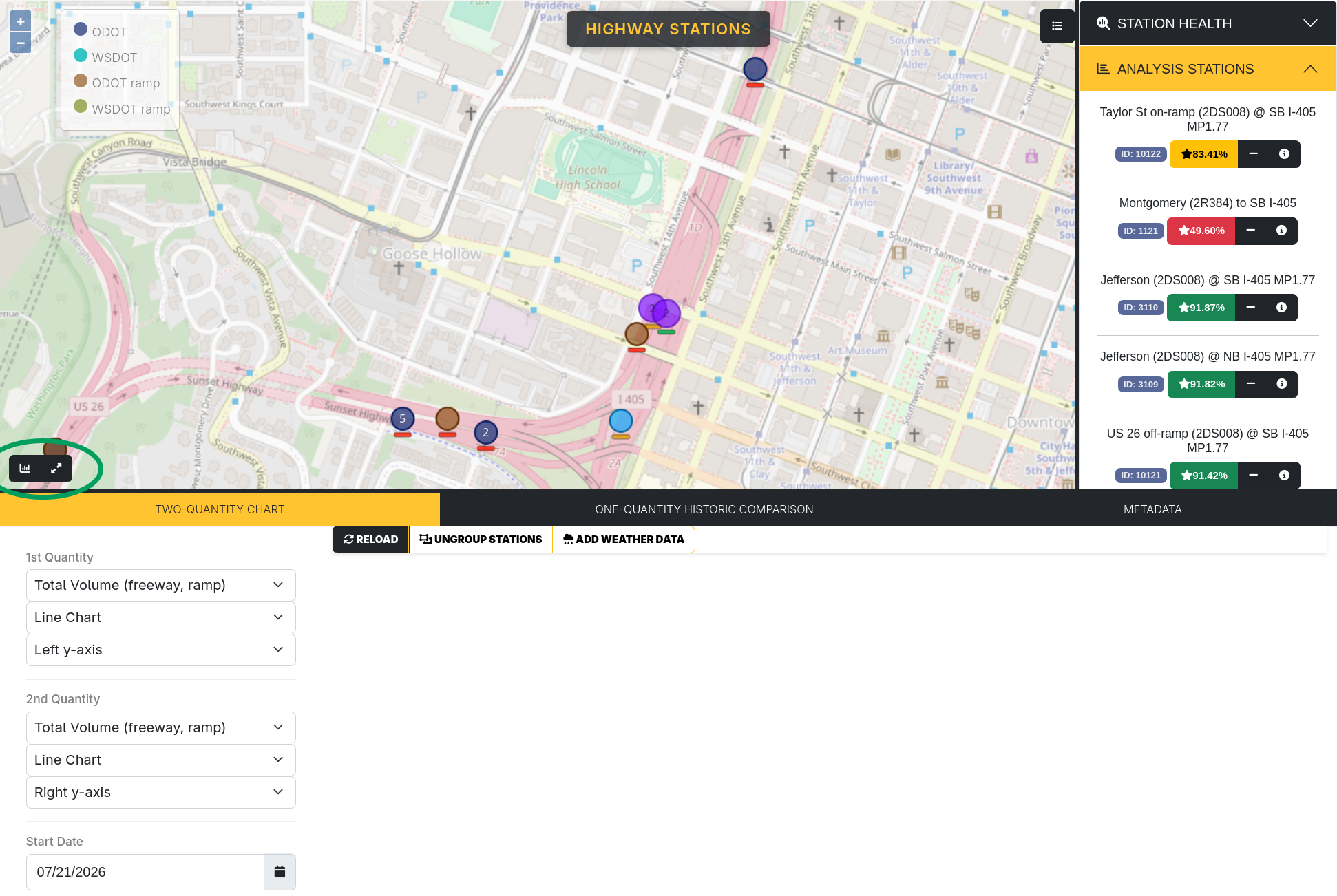
There are three tabs in this menu: Two-quantity Chart, One-quantity Historic Comparison, and Metadata. The first two are data visualizations, and the last is an alternative way to select stations to view without using the map. Each of them will be covered in more detail below.
Two-quantity chart
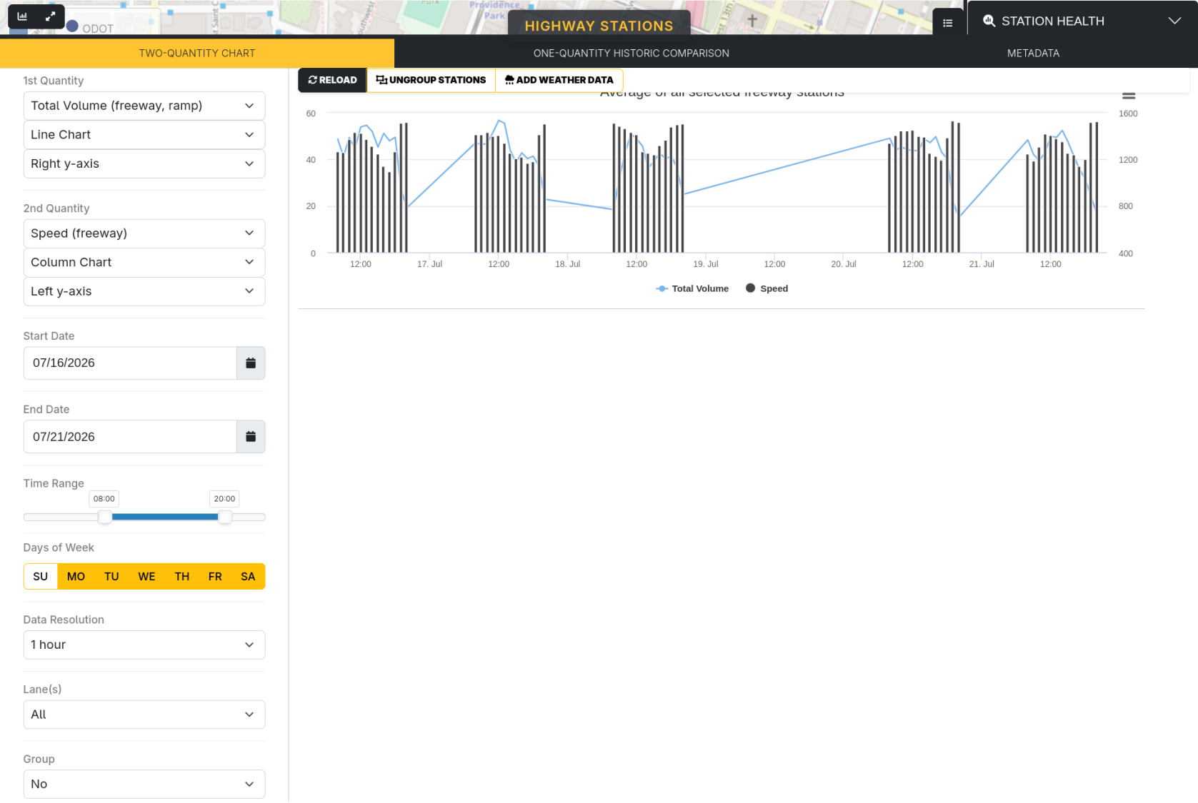
This chart compares two quantities over one time period. There are options for each quantity: which quantity to graph, which type of chart to use, and whether the scale is shown on the left or right y-axis. To generate a new chart, either initially or after changing chart settings, press the Reload button at the top of the tab.
The next couple options restrict the time range for the graph: Start Date, End Date, Time Range, and Days of Week. The Data Resolution option changes how the data is aggregated into distinct points: one for every 5 minutes, 15 minutes, 1 hour, or 1 day.
By default, every lane is included in the chart, but individual lanes can be selected with the Lanes option. The lane numbering goes left-right, so the leftmost lane is lane 1 and so on. The number of lanes appearing on that option depends on the number of lanes monitored by the selected stations. Lastly, if multiple days are selected, the Group option can show an average or sum across those days.
In addition to options to the left of the chart, there are two to the right of the Reload button. Ungroup Stations creates a different chart for each included station, instead of averaging across all stations. Add Weather Data creates an additional chart showing weather data (temperature and precipitation) over the selected date/time range.
One-quantity historic comparison
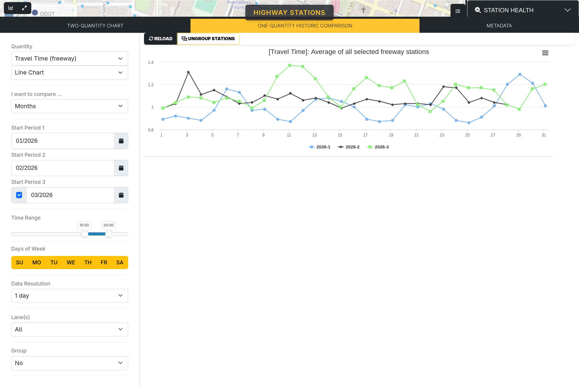
The one-quantity historic comparison options are mostly the same as in the two-quantity chart, except only one quantity is able to be selected, and there are additional options below the quantity selection for the historic comparison. A chart can compare across different days, weeks, months, or years. Two start periods, plus an optional third, can be selected to compare between. Note that any data resolution higher than 1 day is limited to 31 days or fewer. Again, press the Reload button to generate a chart.
Metadata tab
The Metadata tab shows a table of all stations, which can be filtered and searched to find specific stations and add them to Analysis Stations without using the map.
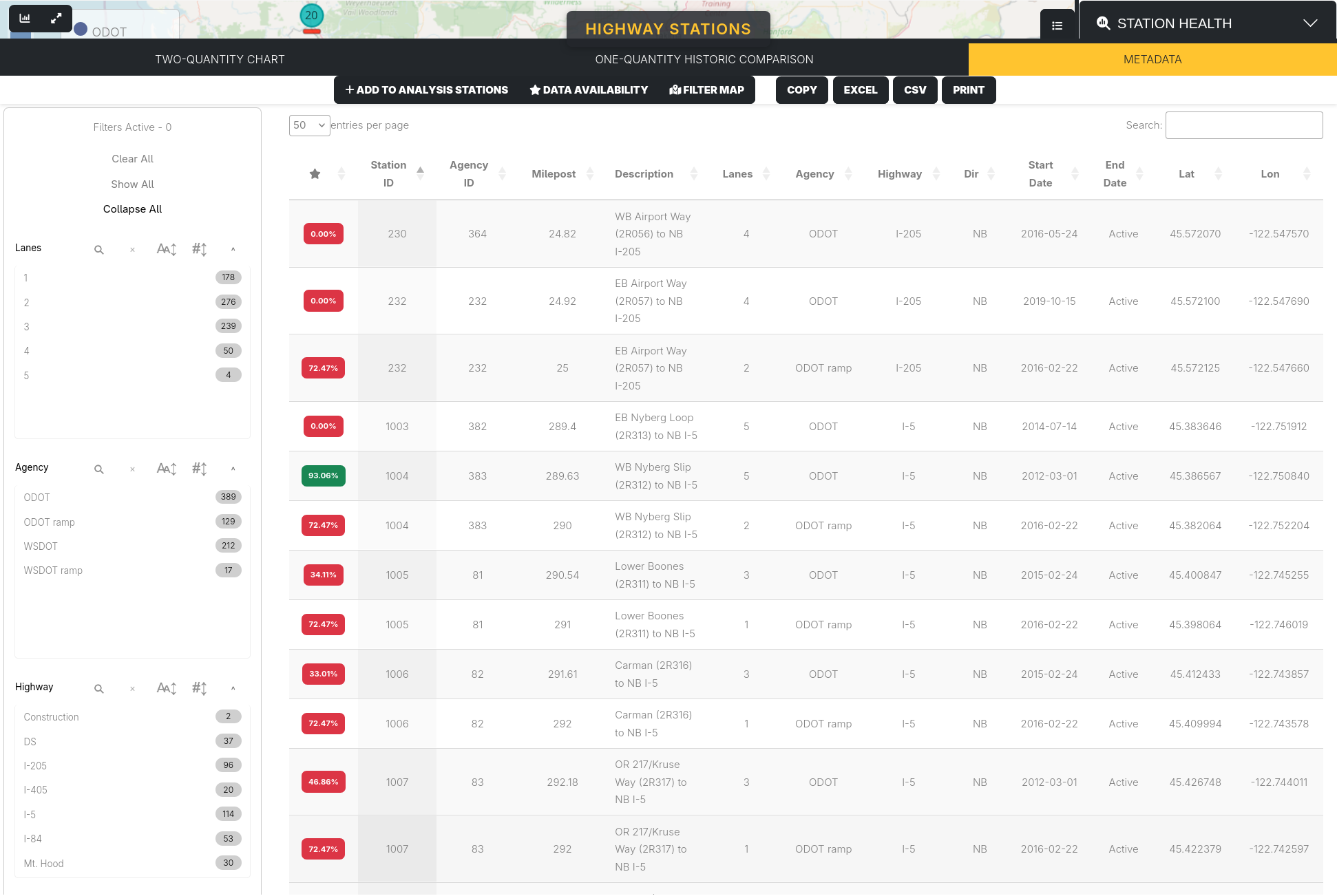
The filters are listed to the left of the chart: Lanes (the number of lanes a station monitors), Agency (which agency is in charge of the station, as well as ramp vs mainline stations), Highway (which highway the station is on), Direction, Active (whether or not the station is active within the time period viewed), and Data Availability (green/yellow/red). The Data Availability is determined by the scale selected in Station Health. The top left shows how many filters are active, and has options to clear all active filters and show/collapse all filter menus.
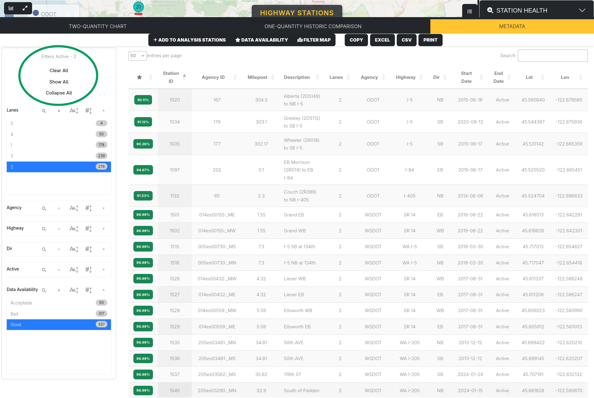
Each filter menu has a search button, used to search for specific values. This is most useful for the Highways filter, which lists many different highways. To the right of that are an x button to clear that filter, alphabetic and numerical sorting for the menu, and a button to show/collapse that menu.
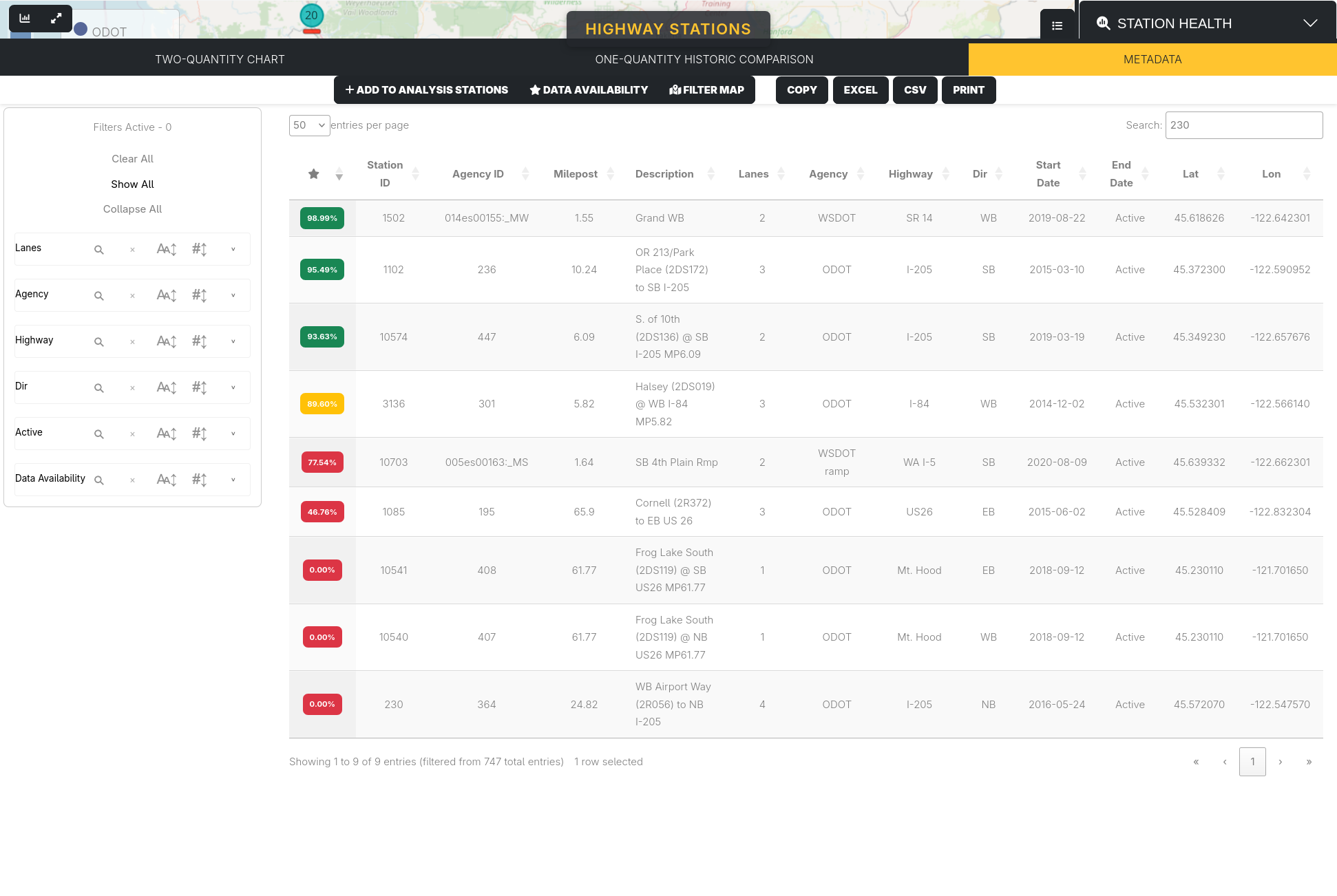
The table can be sorted by the value of any column, as well as searched for specific values. All columns are searched by this, as can be seen by searching 230, which shows the station with StationID 230 as well as stations which have a latitude/longitude including 230.
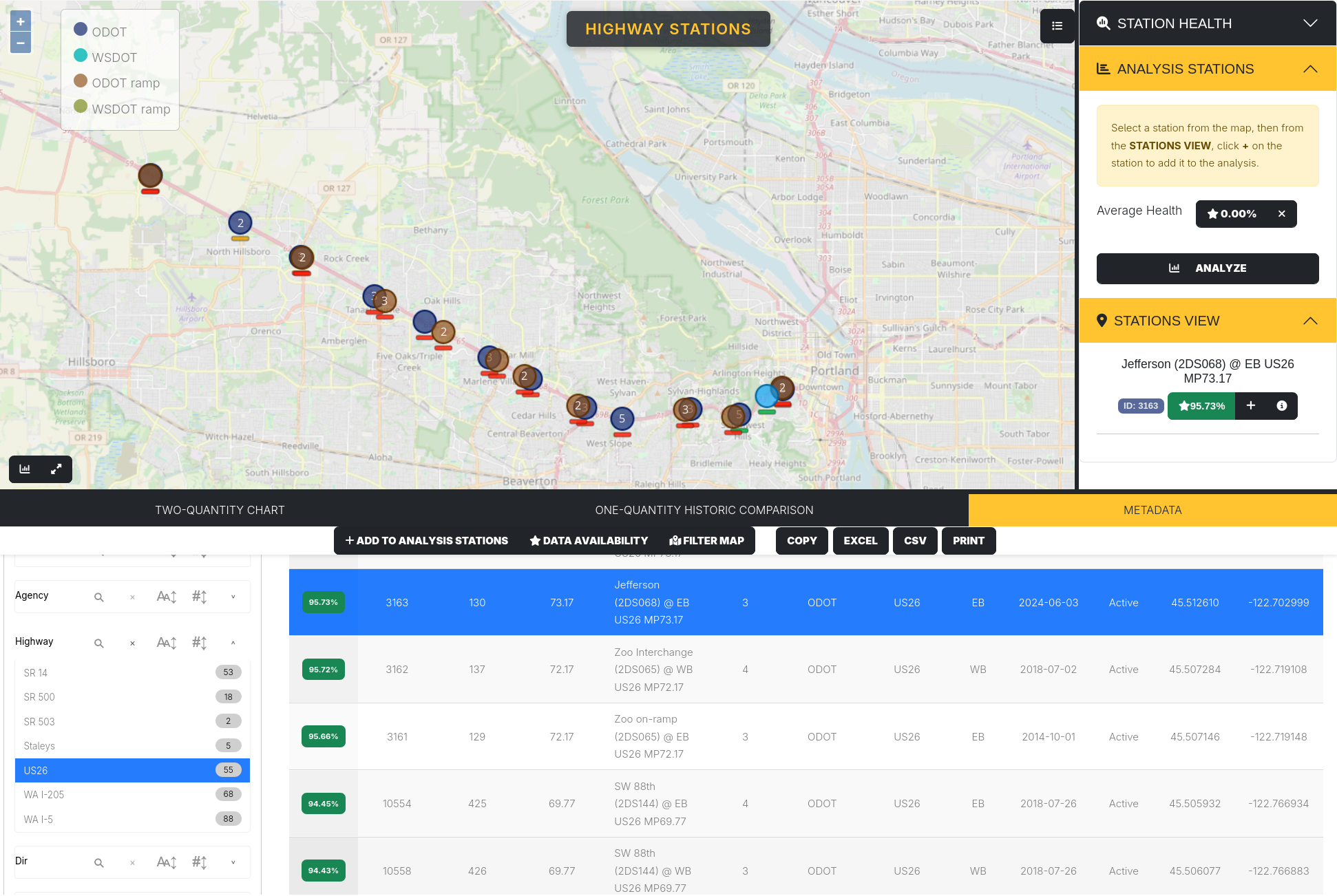
There are also various options at the top of the Metadata tab. Clicking on a row in the table to select it and pressing Add to Analysis Stations adds that station to the list of stations in the Analysis Stations tab. Data Availability shows a chart of the data availability for the currently selected station. Filter Map changes the map to only show the stations currently shown on the table:
Lastly, the Copy, Excel, CSV, and Print buttons all save the information of the currently selected table row.